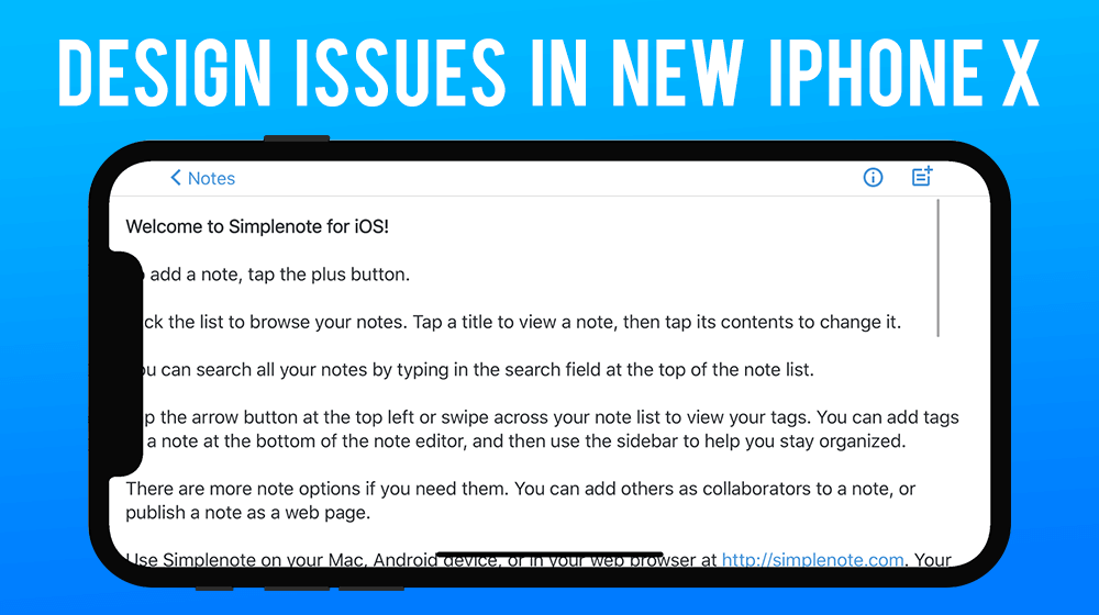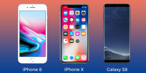
Apple’s talk about all iPhone X benefits and features have been highlighted in front of the people, but to our amazement there are certain designing defects which have been found in iPhone X. The screen of iPhone X is edge-to-edge dominating the front look of the phone. Absence of top bezel intact, the camera array of Apple can be easily noticed which gives an odd look to the phone.
For easy accommodation of the notch, the bezel could have been thick enough but it is instead very thin. Despite of knowing the importance of Symmetry they overlooked it which lead to a disaster in the designing of the phone. The issues have been pertaining to not only the hardware, but the software of the phone too face certain issues. While we keep the phone on landscape mode and undergo browsing the webpages appears with white bars on the sides due to which the scroll bar disappears giving it a weird look.
The photo are just centred on the screen of the phone which does not serve with an option of switching between the notched and notch less views. Considering your photo to be wide enough, it cannot avoid the notch areas which will cutout your photo. Talking about the web browsing now, Apple very well knows that content cannot be hidden under the notch but as an alternative what apple does is applying white margins on one of the sides of the page this does not give an attractive look to the webpage.
Due to introducing the Face Id to get access of the phone, Apple has kept the camera’s array larger than the normal one which leads to cutting out a bigger portion of the image which is not acceptable by many of us.
The iPhone usage in the horizontal mode pops up with lot many issues in terms of the display of the phone, but the use of the phone in Vertical mode disappears all of those. The content is not being centered in the horizontal orientation which is the major drawback of the phone.
Despite of keeping the phone full screen to give the users altogether a different experience, Apple has kept black curved edges on the bottom of the display which gives users the feel of the old regular iPhone 8 and does not turn out to be a unique experience for them.
Because of the sensors on the top of the phone, the status bar on the top is now split into two parts which again is a distraction in the looks of iPhone X.


