As the word says, the first impression is the best. Indeed, in this digital realm, UI and UX are important to create a lasting impression on websites, applications, or any other marketing elements.
Thus, designers, developers, and website owners primarily focus on improving the strategy, survey, structure, layout, and other functions that ensure a good UX and UI. After in-depth investigation, research, and testing, some possibilities spoil the overall design and hence creating bad ux examples.
While speaking about the user interface, designers can add visually appealing elements or add new elements through updates. But what’s the case of UX? Yes, you can also add some new features during updates. How does the user feel?
Don’t they sense inconvenience while using the applications, software, or website? For sure, bad UX designs affect potential users and make them frustrated. But have you ever felt such things in your mobile applications or website? You might be.
There is a widespread problem with user experience (UX) design, and in this piece, we are going to highlight the best of the worst examples.
This article spots some UX designs that need improvement and explains why they are essential from the user’s perspective. Plus, some simple suggestions to fix the problems are also discussed. So, without delay, let’s get started.
Table of Contents
What Exactly is a Poor User Experience (UX) Design?
Poor or bad user experience (UX) design frequently occurs when there is a failure to comprehend or take into account the user’s needs and expectations. Sometimes, user experience design is so poor that it actually works against its intended purpose, which begs the question, “What was truly going through the designer’s head when making this design decision?”
There are several reasons why this may occur, such as a prioritization of aesthetics over functionality, a lack of sufficient investment in UX design, annoying features, and more. However, regardless of the underlying cause, the repercussions can be significant.
All in all, the UX design should be revised if users have to work too hard to accomplish their goals, are coerced into taking actions they don’t want to take, or become disoriented while attempting to complete a task.
Wondering which are the bad UX examples ? Let’s now take a look at the list of bad UX design examples…
11 Bad User Experience Design Examples
1. WhatsApp
As the most widely used messaging app and one that places a premium on ease of use and productivity, WhatsApp’s inclusion on our list may come as a surprise to some.
WhatsApp is the best and number 1 messaging application. From the beginning until now, they have added enormous features with every update to provide their potential users with a seamless experience.
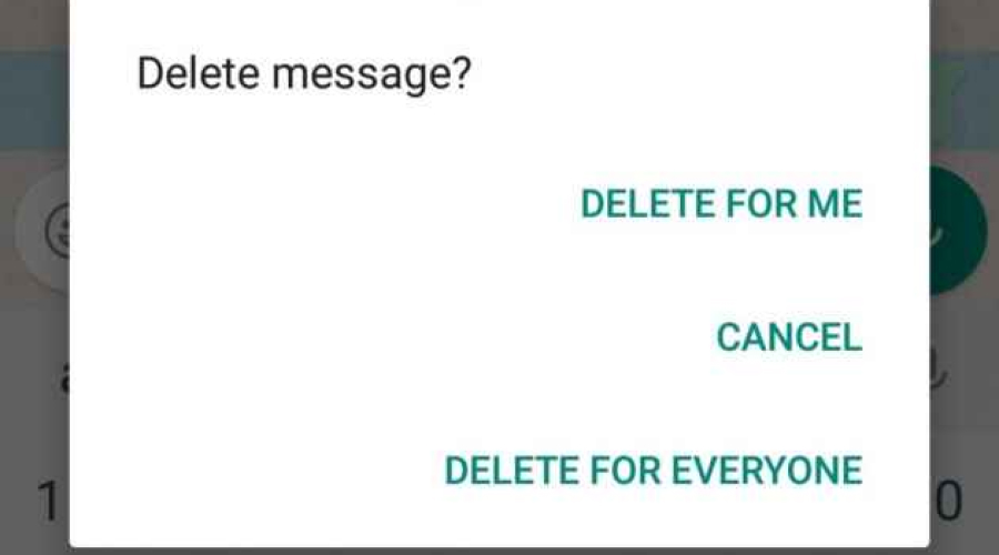
However, one feature makes WhatsApp enter the list of bad UX in mobile applications. Do you know about it? Hope, you already guessed it right. Yes! Delete message feature, i.e., delete for everyone.
When you are composing a private message on WhatsApp to send to a close friend, you may inadvertently send it to another person, such as a contact from your place of employment or a person you do not know very well. This is a situation that is all too often, and we are all familiar with it. It’s not an issue! You are able to delete it and act as if it had never occurred, thanks to the ‘delete for everyone’ tool that WhatsApp provides.
However, the main problem is informing the recipient about the sender’s message.
Even though the main motto of this option is ultimately impressive and essential, displaying text as you deleted, this message disappoints users.
➥ How To Fix It:
Similar to Gmail, there could be a grace period of 5 to 10 seconds. So that users can discard or delete the message before it reaches the recipient.
Just do what it exactly says; try to delete the message instead of blocking it. Thus, the recipient won’t get any clue about the message, and the senders don’t want to give any explanation for the text.
2. Netflix
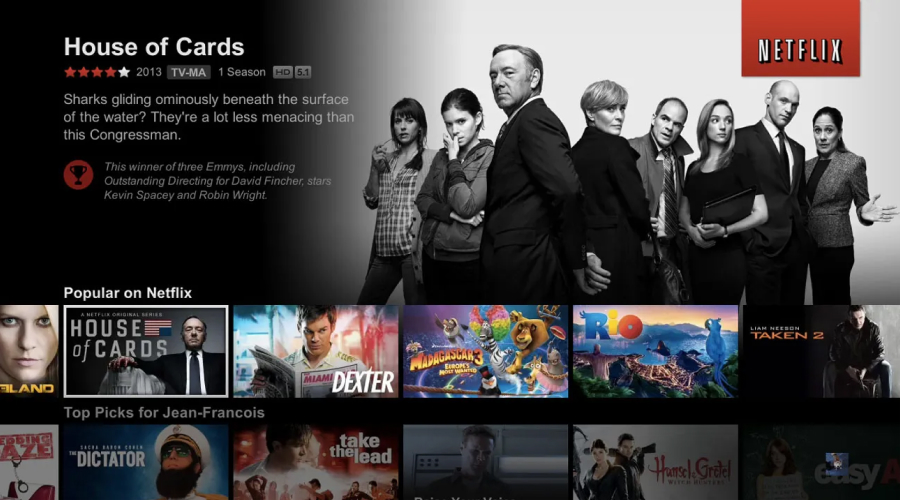
No doubt that Netflix is the most satisfying option for spending time with your friends and family. Still, many users haven’t appreciated the hover auto-play features since its release.
Since it was initially introduced to users in 2015, the autoplay option on Netflix has been a source of annoyance for subscribers. This feature says that viewers can’t click to check their favorite movie details without watching a loudly looped trailer or clips.
Since its launch, it has been a huge problem for potential Netflix users. However, for every problem, there is a solution. Let’s take a glance at them.
➥ How To Fix It:
Auto-playing on any platform is not a suggestive UX design. Therefore, focus on user-friendliness and try to make them more comfortable instead of boosting engagement through clips. Following it enhances the performance of an overall application that gives the best experience for users.
3. Ryanair
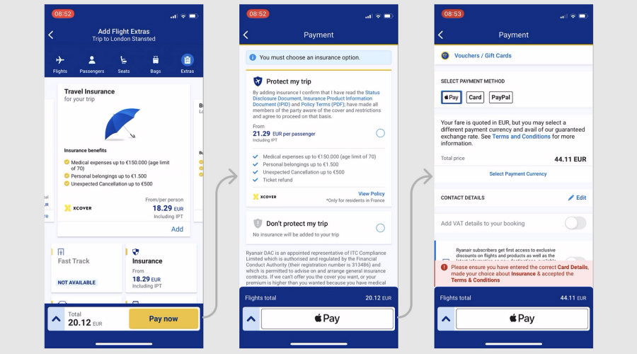
If you’re fond of flying, then you would have chosen the Ryanair application for booking tickets. It is the best application with enormously pleasing features and has given users a good experience since its release.
Despite the abundant benefits Ryanair holds, it is also becoming a solid example of dark UX design. Yes, this application can mislead users while selecting options. Many people feel confused and have navigation difficulties. The overall user flow is comparatively complex and also offers users unpleasant experiences.
Let’s experience it through a glimpse of the event. Imagine you’re planning to spend the weekend at your favorite destination. So you start booking the tickets, but unfortunately, you are redirected to some other options instead of what you press. How will it be? You’ll be tensed, and obviously, everyone wants to be happy while preparing for a vacation.
However, the main intention of the application is to provide a good user experience and other benefits. It doesn’t do what it says, which is a huge drawback in Ryanair’s UX design.
➥ How To Fix It:
Instead of opting for the difficult user flow design, just try to make it more clear and precise. Let the user decide what they need to choose and set apt navigation options to make the booking process easy.
4. Super Long Dropdowns
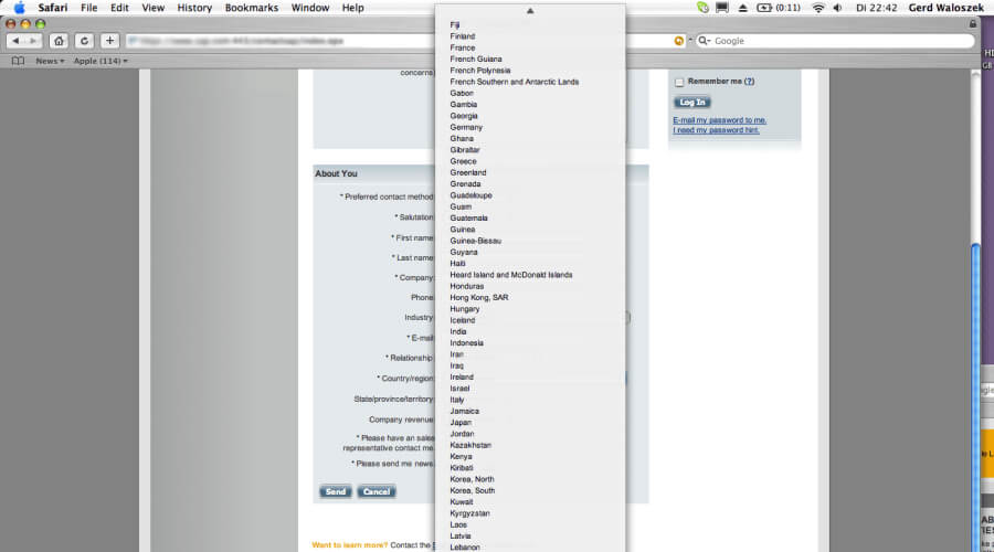
The two examples mentioned above are instances of poor user experience in applications. This serves as an example of bad UX design, which should be avoided on all websites and apps. Yeah! Super-long dropdown menus are the disasters of well-designed platforms.
Most likely, many of you will experience these scenarios. For instance, while selecting the nationality, educational institution name, fonts, or choosing from a wide range of options, you may encounter a never-ending dropdown menu that continues even beyond the bottom of the page.
Incorporating such designs into your websites or apps can negatively impact the overall user experience and undermine the effort you put into creating interactive elements. In addition, the super dropdown menu presents a significant issue as it requires users to invest more time and forces them to endlessly scroll down.
➥ How To Fix It:
Prioritize avoiding the dropdown menus if there are more than ten items in the whole list.
You can also include a text entry field option to get a separate list of what users are searching for. In the other case, you can design it without an auto-complete option.
Another way is to divide the categories and add a classification dropdown menu to simplify the user’s job.
5. Fiverr 5-Star Display
You have all heard about the world’s largest marketplace for digital services, Fiverr. Undoubtedly, it is one of the best platforms for freelancers to offer their unique services globally.
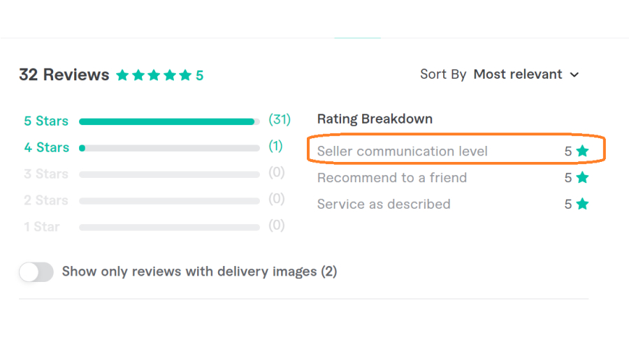
Fiverr changes the default pattern of the 5-star rating design. Instead of displaying five separate stars, they place a single star. The working pattern of this rating also differs from previous versions; if a customer gives 5 stars, then the single star will be as bright as yellow.
It puts a huge disappointment on users’ faces and makes them worried. And users are confused about the rating, whether they choose a single star or five stars. Breaking standard protocols of design has discomforted users. Yes, they are not satisfied with the new stereotypes because people are used to such designs. Plus, it pushes the world-class application into the list of bad UX examples.
➥ How To Fix It:
Change the new design heuristics to default, which helps to light up people’s faces with smiles. In addition, the rest of the features make potential and first-time users more comfortable, so be innovative and creative as before. Don’t break the expectations of users by altering the default settings and design methods.
6. Instagram
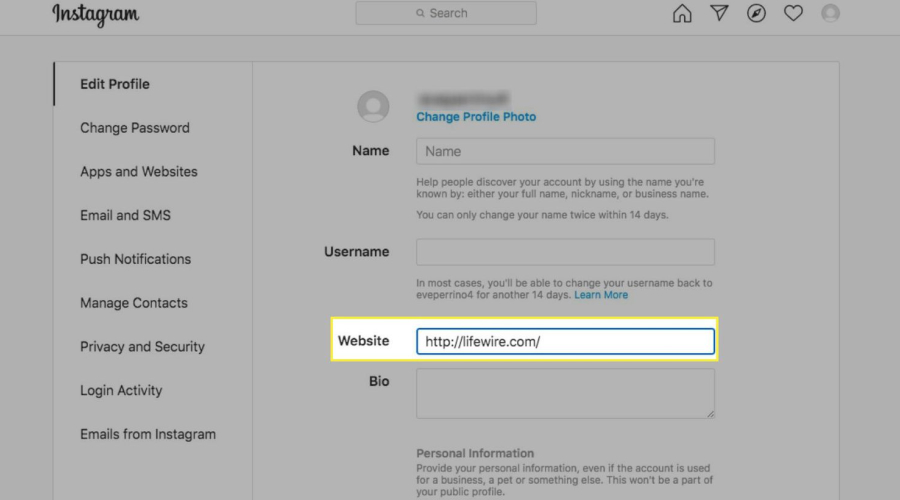
Instagram lovers might be slightly shocked to see it in the list of bad UX designs. But you have to admit that even Instagram has issues with its UX design. Since its release, there have been frequent upgrades with engaging options and visually appealing elements. Then, what could be the mistake? Is there anything serious? Comparatively, it’s not a big issue, but such things lead to it being an example of bad UX.
Every little improvement matters while providing an enhanced user experience. In that list, Instagram’s link in the bio is optimized to add some new features. There is a space for one clickable link, which you can paste from your website or other pages. What if it multiplies? This option could be better and pull down the attraction of many content creators.
No one could claim these optimizing changes as bad UX examples; still, improvising is not a crime, isn’t it? So, just follow these things to make it more appealing and engaging.
➥ How To Fix It:
Add space for many links if the user is a digital influencer, which gives them the best results and makes Instagram a better place for marketing.
Integrate clickable elements in the post, buttons, tags, or any other mode to make them stay for a while. And provide analytics to view the click-through rates, engagements, and other activities of the potential users.
Incorporating such things into the design makes it more elegant and sets Instagram as the right place for influencers.
7. O2 Chat System
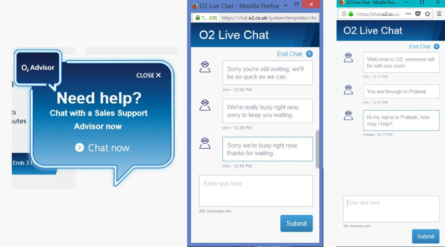
O2 is a popular chat system that bestows plenty of benefits on its users. It encourages real-time convenience for customers, 24/7 support, an enhanced customer experience, and saving money.
What is wrong, then? Chat Now service is not available for every user because there is a message showing “Sorry, you’re still waiting.” Such things frustrate the users, and as it says, there is no immediate response available. It makes O2 an example of bad UX.
➥ How To Fix It:
Fixing it doesn’t need any creative ideas; just enhance the customer support options in chat now and witness improved ratings.
8. Apple
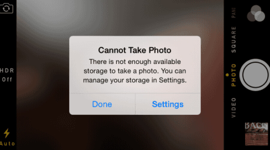
None of the people would think of Apple coming in the bad UX examples list. However, elevating the product’s features, functions, and quality is significant in this fast-paced technological era. Now, let’s discuss: What is the problem with Apple?
A single snapshot message that frustrates the users at the most needed times. Capturing moments on an iPhone might be the dream for many because of the high resolution, clarity, and in-built features. What if your iPhone indicates that you cannot take photos? Particularly, you can’t capture pictures during priceless and time-sensitive moments. For sure, it is a pretty annoying thing to watch.
Do you think this simple reason alone is enough to include Apple in the bad UX example list? No, definitely not. The ultimate cause is that there is no choice for users; only the snapshot implies they must enter settings or leave the camera application. Most importantly, it happens only while capturing; there are no alert messages or notifications earlier. It makes the condition worse.
➥ How To Fix It:
Improve accessibility according to the user’s requirements. A better solution is to alert the users with earlier notifications or display snapshots while opening apps associated with the camera. Also, you can add a user-convenient option in the snapshot to improve its usability and make it more user-friendly.
9. IMDB
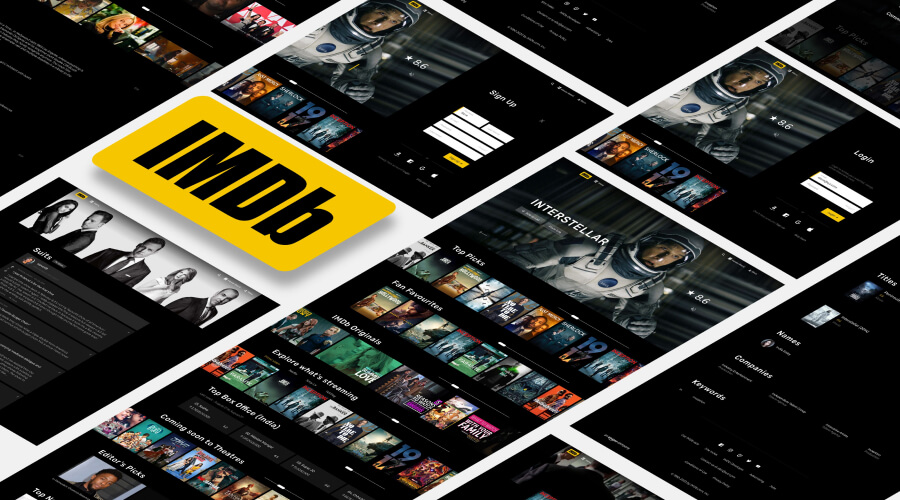
IMDB is a prompt site that offers limitless information about entertainment programs like shows, movies, artists, etc. Too-cluttered website layout, minimal color variation, and enormous ads make it enter the list of bad UX examples.
Plus, navigation and colors play a vital role. Throughout the site, they included the same color, which can be improved to make it visually appealing.
➥ How To Fix It:
Try to add white space to the overall design and make the navigation simple for every user. Work on improving the layout to offer a better experience for first-time visitors.
10. Hulu
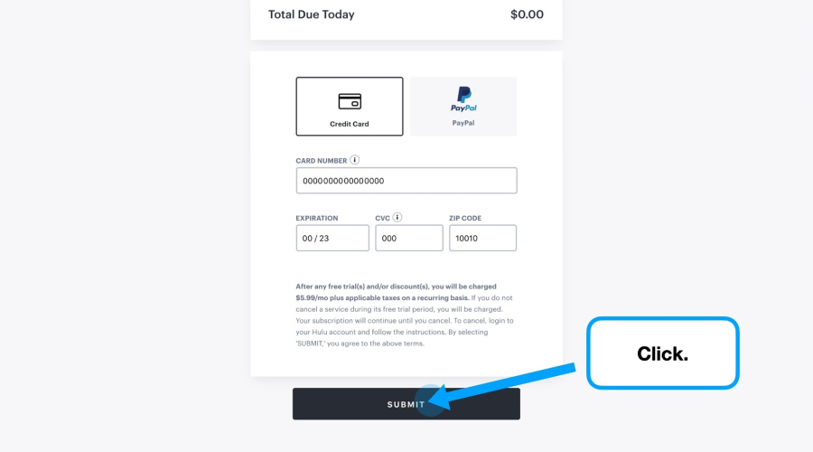
A significant proportion of consumers are increasingly accessing content through mobile applications rather than traditional websites. Because of this, people are unable to get the complete digital experience that the website or product has to offer. Hulu sends users to a separate website where they can control their Hulu subscriptions. Therefore, there is no requirement for the app to contain a tab.
What makes Hulu’s user experience (UX) so bad?
When it comes to mobile applications, it is recommended that the menu choice contain only the most important buttons. Because of this, an unnecessary quantity of pixels can be avoided. The designer of the app has failed to meet expectations because they have included a page that has no purpose other than to display copy. The designer does not successfully maintain the number of feature requests as low as they should be.
➥ How To Fix It
Reduce the number of taps required to access content in order to streamline the navigation process for users. Make it simple for users to locate the information they seek.
11. The Juicero Juicer
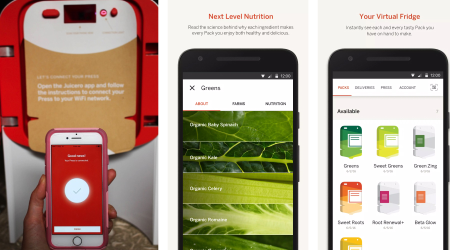
Juicero Juicer is well-known for its aesthetics and stands out from other similar products for its bewitching features. Still, it comes under a bad UX design list; do you know why?
It is an exceptional product from the other juicers, but it also has some complications to make and drink the juice. It seems that they focus on visually appealing elements compared to functionality and accessibility. You need a robust internet connection and must download either the Android or Apple Juicero applications to learn about the procedure for making juice.
Such things disappoint the users and make them frustrated. However, for every mistake, there is a right solution. Let’s have a look.
➥ How To Fix It:
As every developer and designer knows, testing is crucial all the time. So just start with user testing to resolve the exact problems and get accurate results. Examine everything—how a user feels and what their actual requirements are. Plus, it reduces the complications in the overall process, makes it accessible with basic features, and adds some premium functions while accessing it through mobile phones.
Putting it all together!
So, there you have it: the list of bad UX design examples. Creating user interfaces that are aesthetically beautiful and intuitive should be the ultimate goal of any user experience designer. It needs to instill trust, which will lead to more purchases. All of the aforementioned mistakes are major causes of bad UX and should be avoided at all costs when creating a design that will benefit the end users. Focus more on the nitty-gritty details that matter rather than the broad topics that users may or may not care about. In addition, conduct timely surveys to address the issues and update them according to the requirements. Satisfy potential users with an enhanced user experience.
Know that a bad UX design can be the most prominent reason to craft the best application, website, or product. So, make use of these bad UX design examples to create the best app or website!
Happy Designing! 😊 😊

