Which color should you choose for the design? Which fonts look good? If you are a non-designer of graphics and willing to put your foot into the realm of graphic designing, then these questions are natural. You must also be wondering how professional graphic designers create designs that look very complex to you and
fascinate you and the viewers or the consumers. You may also think about how graphic designers choose the precise fonts and colors for the design. However, you must discern that they are only perfect in their field with their years of hard work and lots of technique and some of the designing hacks.
If you want to take up graphic designing for your career, you must exploit Instagram for that. As an artist, you need to know that there are no particular ordinances that you will have to memorize for becoming a graphic designer.
Top Hacks or Tricks for Graphic Designer
This article will give some of the top hacks or tricks that the professional graphic designer employs while working on different projects, especially in social media like Instagram.
► Use of contrasting fonts
As a graphic designer, it is one of your tasks to select the right and varying fonts for your graphics, particularly for Instagram. When you are creating a design, you need to keep in mind that your only objective is to draw people’s attention; therefore, you need to wisely choose the fonts’ size that complements your theme of the design. You must assign bright colors that create harmony in your design. Make sure that the fonts present in your plan are well balanced so that your design stands out among the puddle of various methods.
► Use matching colors in your design

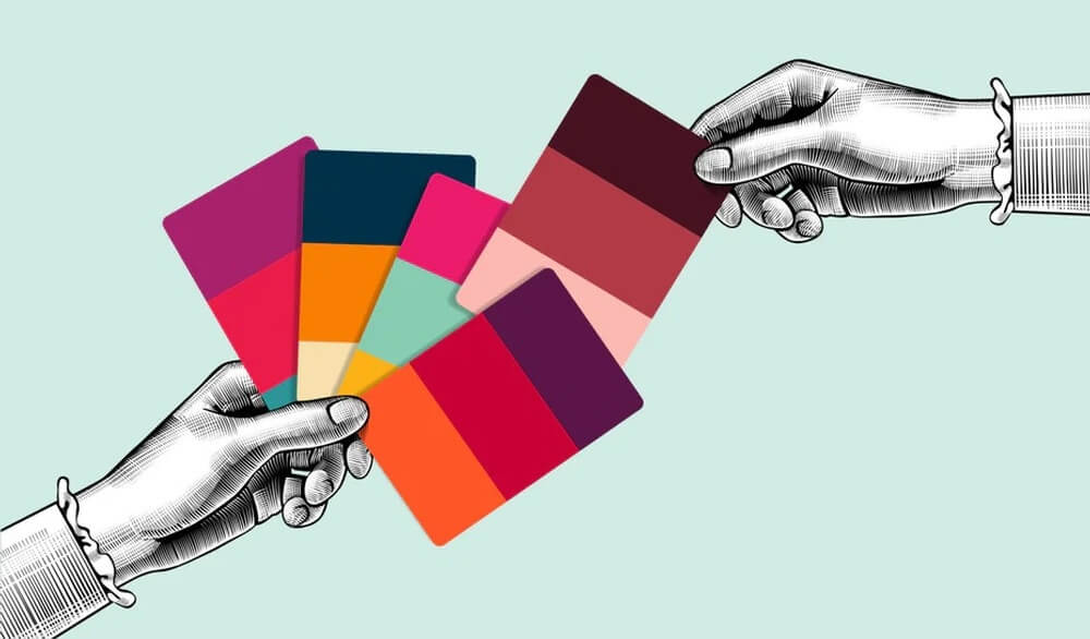
One of the elements that grab user’s attention is selecting colors in the graphics. Colors play an essential role in creating symmetry with your layout. It is advisable to choose the paint theme before proceeding with other aspects since the colours play a meaningful function for any graphic designer. If you want your design to look unusual, you can also use the colours pixel tool that will help you choose colours that will match your background image. When the users of Instagram see that your colours are in communion with the design, they will surely get impressed by your plan and become your customers.
► Use of grid network for portrayals
In today’s world, the users of Instagram give more preference to elements that are appropriately aligned. Your design will get neglected if the users see that the images and the ingredients in your method are scattered and unaligned. When you make use of the grid system, then it makes your design systematically balanced. By using a grid system for your plan, you will get the opportunity to make your design more relatable to the users. When you use a grid system, the overall design gets changed, and people tend to correlate with them more than the inadequate and turbulent images and elements.
► Usage of transparent icons
To enhance the design, you can also use transparent icons, which will help you draw the viewers’ attention. It will also help your design to stand out. When you add slight transparency to your plan, the viewers know that you are very imaginative.
► Use of patterns and icons for demonstrating a message
If you want to create a perfect graphic design, you will have to employ various ways to experiment. For conveying a specific message on social media like Instagram, use of patterns and icons has become one of the ways to create excitement and express creativeness. By using shapes and icons, you will achieve the success that will surprise you. You can buy 50 likes Instagram to proliferate faster here.
► Colour problems in your pictures should get remedied
If you want your viewers to be pleased, you will have to make sure that your images are the best. It is quite an essential aspect of the graphic designing process to focus on saturation. It refers to the vigour of colour in an image or a picture. When you say that the picture is fully saturated, the idea is sharp and striking. And when you decrease the saturation of the image, the image becomes dull and bleached. Thus, you are advised to make your picture appear attractive to the viewers.
► Formulating visual assets for Instagram
One of the effective ways to lead the viewers’ attention is by formulating visual assets for social media such as Instagram. It has proven more fruitful than broadcasting frequently on social media.
To create a perfect design, you must not spend endless nights, but you can surely draw people’s attention towards you by using some of these hacks. Those above are some of the hacks you can employ. Thus, you will become a designing pro overnight on Instagram.


