Improving user experience (UX) and engagement requires a well-thought-out and effective website navigation system. In the end, a well-designed navigation structure lowers bounce rates and increases conversions by encouraging users to explore more material and making information easier to discover.
Websites are able to efficiently serve a variety of user demands when they employ search functions, detailed labeling, and logical menu organization. Smooth navigation guarantees that consumers can quickly find the items or information they’re looking for, creating a favorable impression and enticing them to return.
What is Website Navigation?
Website navigation is the arrangement of buttons, links, and other features that let visitors navigate a website and see its information. As a kind of roadmap, it directs users to the many areas, pages, and features on the website. User-friendliness, simplicity, and clarity are hallmarks of effective navigation, facilitating information retrieval and task completion.
Often seen navigational components include call-to-action buttons, search bars, menus, and breadcrumbs; each is positioned with purpose to improve user experience (UX). A well-designed navigation system facilitates easy interaction with the website’s offers, which boosts engagement and conversion rates in addition to improving usability.
Why Website Navigation is Important?
The user experience (UX) of a website is greatly improved by its navigation, which makes it easy for users to discover content and move between various areas of the site. Facilitating easy access to and exploration of material lowers bounce rates and boosts engagement.
Well-structured and well-linked sites are easier for search engines to scan and index, thus efficient navigation helps SEO efforts as well. Websites may enhance consumer satisfaction and conversion rates by offering unambiguous pathways to information, goods, or services. Optimized navigation supports overall site usability, functionality, and business objectives in addition to facilitating user engagement.
Types of Website Navigation

There are several varieties of website navigation, each fulfilling distinct functions and accommodating diverse user preferences:
1. Horizontal Navigation
This is the navigation bar at the top of the page that extends horizontally, usually showing the main categories or parts of the website. It provides a quick and concise summary of the alternatives accessible, making it simple for visitors to navigate to various areas of the website.
2. Vertical Navigation
The menu items are displayed in a column format on the side of the webpage via the vertical navigation. It offers a systematic method of accessing various content regions directly from the side of the page, making it helpful for websites with a deeper hierarchy or several parts.
3. Breadcrumb Navigation
The user’s route from the homepage to the current page is shown via breadcrumb navigation, which is located at the top of the website. It helps users understand their location within the website’s structure and allows them to navigate back to previous levels quickly, enhancing usability and user experience.
4. Footer Navigation
Links to important sites, including contact details, privacy policies, terms of service, and other resources, may be found in the footer menu, which is located at the bottom of the page. In order to guarantee that users can access crucial information wherever they are on the website, it acts as a backup navigation tool.
5. Hamburger Menu
Three horizontal lines piled on top of one another usually serve as the symbol for this small menu. It’s often used to save space on responsive designs and mobile webpages. It is expandable upon clicking or tapping to provide a navigation menu that gives users access to different website parts or pages without cluttering the user interface.
6. Mega Menu
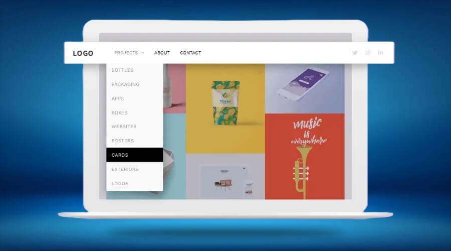
Mega menus are enormous dropdown menus that include many tiers of navigational choices shown in a single panel. To make complicated websites easier for consumers to browse, they often contain graphics, symbols, or more information. With its visually stimulating and well-organized layout, mega menus are especially helpful for websites that have a large number of content or product categories.
What is Website Navigation Menu? How to Use It?

Users may move between parts or pages of a website by using the visual representation of links found in a website navigation menu. Usually positioned for convenience across the website, it appears as a bar, list, or dropdown menu.
Think about these recommended strategies to get the most out of a navigation menu:
- Simplicity and Clarity: Make the menu straightforward and mark each part or page with precise, succinct descriptions. Refrain from providing consumers with many alternatives.
- Hierarchy: Menu items should be arranged in a hierarchical fashion, with key categories being shown at the top and secondary or tertiary alternatives being available via dropdown menus or submenus.
- Consistency: Maintaining consistency across all website pages requires placing the menu in a dependable area, such the side or top of the page.
- Responsive Design: Make sure the menu is mobile-friendly and adjusts to various screen sizes using responsive design. To reduce space on mobile devices, think about using a hamburger menu.
- Visual Cues: To improve usability and efficiently direct people around the website, employ hover effects, colors, or icons to highlight active links or dropdown choices.
A well-designed navigation menu improves user experience by enhancing overall site navigation and making information readily discoverable by implementing these techniques.
Causes of poor Website Navigation
A number of crucial elements that have a big influence on user experience and website operation may lead to poor website navigation, including:
1. Complex Structure
Users find it difficult to effectively access needed information on websites with complex navigation frameworks, which overwhelms them.
2. Unclear Labels
As users search for relevant material, unclear or deceptive menu labels cause them to get frustrated and confused. This raises bounce rates.
3. Lack of Search Functionality
When a website has a lot of material, consumers may find it more difficult to reach certain content directly if there isn’t a conspicuous search bar.
4. Non-Responsive Design
Websites that are not mobile-friendly or do not adjust to multiple screen sizes impede the seamless navigation that current consumers have come to expect.
Also See: The Impact of Good Website Design on Business Success
5. Broken Links or Errors
When links take users to error pages or dead ends, they impede their ability to navigate a website and erode their trust in its dependability and usefulness.
6. Overreliance on Dropdown Menus
An over-reliance on dropdown menus may overload users and make navigating difficult, which can frequently result in irritation. This is especially true with complicated dropdown menus, especially ones with numerous levels.
7. Inconsistent Navigation
The entire user experience is negatively impacted by inconsistent navigation, which confuses visitors and interrupts their browsing flow. This may be achieved by a consistent menu structure or navigation layout across various pages.
Website navigation may be greatly improved by addressing these problems using intuitive design principles, descriptive and clear labeling, flexible and accessible layouts, and powerful search features. This will increase user satisfaction and retention rates.
How to Improve Website Navigation?
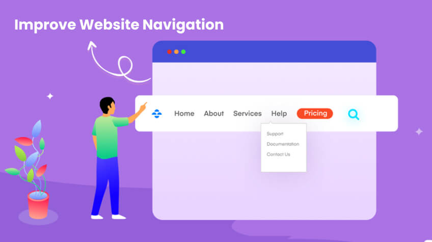
Several crucial tactics to improve user experience are involved in improving website navigation:
- Simplify Menu Structure: To cut down on complexity, simplify and arrange menu items rationally.
- Clear Labelling: Make sure your labels appropriately describe the parts or information by using succinct, clear language.
- Implement Search Functionality: Include a powerful search bar so people may locate relevant information fast.
- Responsive Design: Make sure the navigation is responsively designed so that it works well on various devices and is nice to mobile users.
- Breadcrumb Navigation: Provide breadcrumbs for easy user navigation. This will allow them to quickly follow their journey.
- User Testing: Testing and user feedback gathering are two methods used in user testing to find and fix navigational problems.
Websites may optimize navigation by concentrating on these areas, making it more user-friendly and intuitive for visitors.
In summary, providing a smooth user experience depends on improving website navigation. Websites may guarantee that users can quickly locate content and move between areas by emphasizing utility, clarity, and simplicity. Positive user journey components include clear labeling, user-friendly menu structures, responsive design, and effective search capabilities.
It is essential to regularly evaluate usability and gather user input in order to enhance navigation tactics, pinpoint problems and put changes into place. Ultimately, an effective navigation system lowers bounce rates, increases engagement, and promotes user pleasure and loyalty, all of which contribute to the website’s ultimate success.


