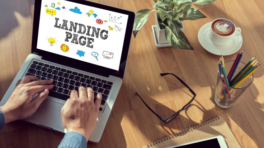
Your landing page is your online storefront, and just like a physical store, you want it to be inviting and attractive. If your landing page is cluttered, confusing, or unappealing, potential customers will quickly lose interest and move on to a competitor’s website. Therefore, creating a landing page that is quick to load, simple to navigate, and visually appealing is essential.
Think of your landing page as a solution to your customer’s problems. Your job is to convince them that your product or service is the answer they’ve been searching for. From the headline to the call to action, every element of your landing page should be carefully crafted to create an irresistible offer that your visitors can’t resist.
What is a Landing Page?
A landing page is like a special web page with one main job: to convince people to do something, like buy a product or sign up for something. It’s different from a regular homepage because it focuses on getting visitors to take a specific action. People usually end up on a landing page after clicking an ad or a link.
It has clear pictures, convincing words, and easy-to-use buttons to guide visitors. The goal is to grab attention and get people to do what the page wants, whether purchasing, joining, or filling out a form. A good landing page makes things easy and convincing for visitors.
Why do you need a Landing Page?
A landing page is like a friendly guide that helps websites achieve specific goals. Imagine you’re throwing a party, and the landing page is the invitation. It’s designed to welcome guests (website visitors) and guide them to the main event, whether buying a product, signing up for something, or sharing information.
Unlike a crowded homepage, a landing page keeps things simple and focused, like giving clear directions. It’s essential because it makes the journey smoother for visitors, increasing the chances of doing what the website owner wants, like purchasing or joining a community. It’s like rolling out the red carpet for online success!
Tips to create an effective Landing Page
To create an effective landing page, find out the following landing page tips
1. Use Clear And Concise Copy
When it comes to creating a compelling copy for your landing page, clarity and simplicity are essential parts of landing page tips. Your visitors are looking for quick answers and solutions to their problems, so you want to ensure that your copy is easy to understand and straightforward. Steer clear of using intricate technical terms or jargon that could potentially bewilder your audience.
Consider breaking your copy into short paragraphs and bullet points to make it more engaging. This makes it easier for your visitors to scan and digest your message quickly. Additionally, using SEO content writing tools can help you optimize your copy for search engines, increasing your page’s visibility and driving more traffic to your site. One of the key benefits of a landing page is by combining clear and concise copy with effective SEO techniques, you can create a landing page that converts visitors into customers and attracts more visitors to your site.
2. Keep It Simple And Focused
Keep your landing page simple and focused. A key landing page tip is to create a page that’s easy to navigate and delivers a clear message to your visitors. This means keeping distractions to a minimum and highlighting the key benefits of your product or service.

To create a compelling value proposition, consider your product or service’s unique features and benefits. Differentiate yourself from your competitors and position your offer to resonate with your target audience. Once you have a clear understanding of your value proposition, make sure that it’s communicated clearly on your landing page. Use concise and persuasive language to convey the benefits of your offer and show visitors how it can help them solve their problems or achieve their goals.
3. Readable Fonts
Pick fonts that are easy on the eyes! Select clear and readable text styles, like a friendly, enjoyable book. Ensure your words are easy to understand, avoiding fancy or complicated fonts that could strain visitors’ eyes.
Think of it as choosing a comfortable chair – you want your visitors to sit back and absorb your message without discomfort. When your fonts are easy to read, it ensures that everyone can effortlessly grasp your content, making the whole experience smooth and pleasant for anyone who visits your landing page.
4. Create A Compelling Headline
Crafting a compelling headline for your landing page is an another part landing page tip to capture your visitor’s attention and keeping them engaged. It should convey the key benefit of your product or service in a manner that strikes a chord with your target audience. A great headline can pique curiosity, spark interest, and motivate visitors to read more about your offer.
To create a strong headline, start by identifying your product’s or service’s core benefit. Think about what sets you apart from your competitors and what problems you’re solving for your customers. Then, use that information to craft a clear, concise, and attention-grabbing headline. Consider using numbers or statistics to add credibility to your claim and make it more compelling. And always remember to keep your target audience in mind—your headline should speak directly to their needs and desires.
5. Highlight Benefits
Shine a spotlight on the perks! Tell visitors exactly how your product or service can make their lives better. Explain the problems it solves or the needs it meets, like a helpful friend stepping in. Whether it’s saving time, making things easier, or adding joy, make it crystal clear how you bring value.
Show them the positive impact your offering can have on their lives. By straightforwardly highlighting benefits, you’re not just selling a product – you’re showing how it can genuinely enhance their experience and make a difference by using this landing page tip.
6. Include A Strong Call-To-Action
Your call-to-action (CTA) is an essential part of your landing page tips. Your CTA should be highly visible and easy to understand, clearly indicating what action you want visitors to take. It’s vital to choose action-oriented language emphasizing the benefits of taking action, such as ‘Sign up now for free,’ or ‘Get started now.’ Additionally, incorporating a sense of urgency can help to create a stronger motivation for visitors to take action.
To make your CTA even more effective, consider testing different variations to see which drives the highest conversion rates. This can include testing different colors, button sizes, and even the placement of the CTA on your page. By monitoring the results and making data-driven decisions, you can continuously improve your landing page and ultimately drive more conversions for your business. Remember, your CTA is the final step in the conversion process, so make it count.
7. Use High-Quality Images
Adding images to your landing page can significantly improve the user experience, allowing visitors to interact more effectively with your content. Relevant, high-quality images make your landing page more visually appealing and help convey your message more engagingly. When selecting images, it’s essential to choose ones that are directly related to your product or service, such as images of your product in use or people using your service.
While it can be tempting to use stock images, it’s important to remember that these images can often appear generic or staged. Instead, consider taking your own photos or hiring a professional photographer. By creating custom images, you can have greater control over the visual aesthetics of your landing page, making it more distinctive and memorable.
8. Responsive Design
Make your landing page work everywhere! Ensure it looks fantastic and works smoothly on all sizes of phones, tablets, and computers. Think of it like a superhero costume that fits perfectly, regardless of size. A responsive design ensures your page adjusts and looks great on any device, giving visitors a seamless and enjoyable experience.
It’s like having a friendly companion ready to impress regardless of where your visitors come from. So, when your landing page adapts effortlessly, everyone gets the same fantastic experience, no matter what gadget they use.
9. Available On Mobile Phone
Make sure your landing page works great on your phone! People use their phones often, so your page should be easily read and on smaller screens. Check that buttons are easy to tap, images look good, and everything fits nicely.
A good mobile experience keeps visitors happy and more likely to stick around or do what you want them to, whether buying something or signing up. So, always double-check that your landing page is a smooth and enjoyable ride for mobile users.
10. A/B Test Your Landing Page
A/B testing can provide valuable insights into what elements of your landing page are working and what needs improvement, making it a crucial tool for optimizing your conversion rates. Conducting A/B testing allows you to analyze the performance of different versions of your landing page, enabling you to make informed decisions and optimize your page for optimal conversion rates. This can include testing different headlines, images, copy, calls to action, and other layouts and designs.
A/B testing requires careful planning and execution to ensure accurate and meaningful results. By focusing on one element at a time, such as your headline or call-to-action, you can gain a clear understanding of how each individual change impacts your conversion rates. Testing one variation against your control page ensures that you can isolate the effect of each change and make informed decisions about which elements to keep or revise on your landing page. With this approach, you can optimize your page for maximum conversions and create a more effective marketing campaign.
11. Focus on Landing Speed
Fast landing page speed is like a superhero for your website. Just as a quick-thinking hero saves the day, a speedy landing page saves visitors from boredom. Slow-loading pages frustrate users and might make them leave. To boost speed, shrink image sizes, simplify code, and choose a speedy hosting service.
A rapid landing page ensures visitors get what they came for in a flash, leading to happier users and better chances of them sticking around, exploring, and taking the action you want, whether buying, signing up, or simply enjoying what you offer. Speed, the unsung hero of online success!
12. Respond to the Query
Give quick answers on your landing page! If visitors have questions, make it easy for them to get speedy responses. Use features like live chat or provide precise contact details. When you reply fast, it shows you care and helps build trust.
A helpful and quick response can turn curious visitors into satisfied customers. So, besides having a good-looking page, make sure it’s like a helpful guide, ready to assist visitors on their journey.
In Conclusion
Creating a high-quality landing page is critical to the success of your marketing efforts. By following the landing page tips and best practices outlined in this article, you can design a landing page that is visually appealing and effective at converting visitors into customers or leads.
Remember to keep your copy clear and concise, use high-quality images, and optimize your page for search engines. Additionally, make sure your call-to-action is prominent and continually use A/B testing to improve your page’s performance. With these strategies in place, you can create a landing page that drives results and helps to grow your business.


