One of the primary goals of any designer is to produce designs that are clear and understandable. An easy-to-navigate interface is a key component of every successful design. It is because pages that are well ordered, balanced, and contain content that is easy to read and absorb will naturally result in a much better experience for your users.
An effective design composition is the result of a combination of art-scientific methodologies and elementary mathematical theories used by trained professionals. Designers make use of a variety of resources, including grids, spacing rules, columns, and gutters, among other things.
The golden ratio is a mathematical proportion widely used to create aesthetically beautiful combinations in design.
The article focuses on providing in-depth insight into the Golden Ratio and how it is helpful in Web and UI design.
So, if you’re keen to learn more about Golden Ration, just scroll down to read the full article. Here we go…
Table of Contents
- What exactly is a Golden Ratio?
- How do you calculate the Golden Ratio?
- Golden Ratio in Percentage
- History of the Golden Ratio
- Exactly how can the golden ratio help user interface design?
- The Golden Ratio and Its Connection to Website Design
- What Is The Connection Between the Golden Ratio and the User Interface?
What exactly is a Golden Ratio?
The golden ratio is a mathematical ratio that may be found in many things, both natural and constructed. It specifies the proportions of a shape or building that are considered to be the most aesthetically beautiful. The mathematical concept known as the Golden Ratio may be traced all the way back to the time of Pi.

In the course of human history, philosophers, architects, and designers have utilized the ratio in order to craft forms and buildings that are aesthetically beautiful and mesmerizing.
The Parthenon in Greece and the Pyramids in Egypt are two ancient examples of buildings in which architects utilized this ratio to create a sense of equilibrium between the various structural elements.
The golden ratio’s widespread acclaim stems from the fact that it reflects the world around us and creates a sense of pleasing equilibrium. In this modern era of technology, the Golden ratio can also be used in digital design, similar to architecture. Whether you’re working on wireframes, developing brands, or producing designs that are ready for final production, the Golden ratio is the way out.
How do you Calculate the Golden Ratio?
Since the Golden ratio is both natural, its objective is to create equilibrium and harmony. Know that humans are drawn to things that appear natural. They seek out methods to incorporate natural forms and patterns into their work wherever possible.
In their quest to unlock the secrets of creation, Mathematicians have determined a formula that underlies the vast majority of natural phenomena on our planet, known as the Golden ratio. It is used to create aesthetically appealing designs.

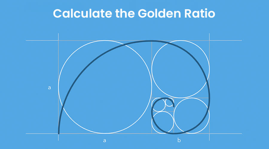
The mathematical expression known as the “golden ratio” is denoted by the symbol “ϕ.” The formula for the golden ratio is ϕ = 1 + (1/ϕ). Additionally, it is equivalent to 2 sin (54 degrees). The ratio of any two consecutive Fibonacci numbers is quite near to the value of 1.618 (Golden ratio).
Golden Ratio in Percentage
The golden ratio is often expressed in terms of three percentages, which are known as significant retracement levels for a stock or an index. These percentages are 38.2 percent, 50 percent, and 61.8 percent.
History of the Golden Ratio
It’s estimated that the concept of the golden ratio dates back more than 4000 years. Experts suggest that the golden ratio is adhered to in the design of many historic structures and well-known artworks.
The golden ratio is used in many contemporary disciplines, including construction, the visual arts, photography, and design. Leonardo da Vinci and Salvador Dali are known to use the golden ratio in their works.
The golden ratio is becoming increasingly popular among graphic designers. Many graphic and UI designers incorporate the golden ratio into their process due to its beneficial effect on the viewer’s perception.
Using the golden ratio, designers can draw logos or icons that call for painstaking precision. They can make images where everything is in perfect proportion to one another. Furthermore, designers work hard to ensure that the logo design is presented in the most engaging way possible, as it is the beating heart of the company. The use of the golden ratio in design can elevate a logo’s visual appeal and appeal to consumers.
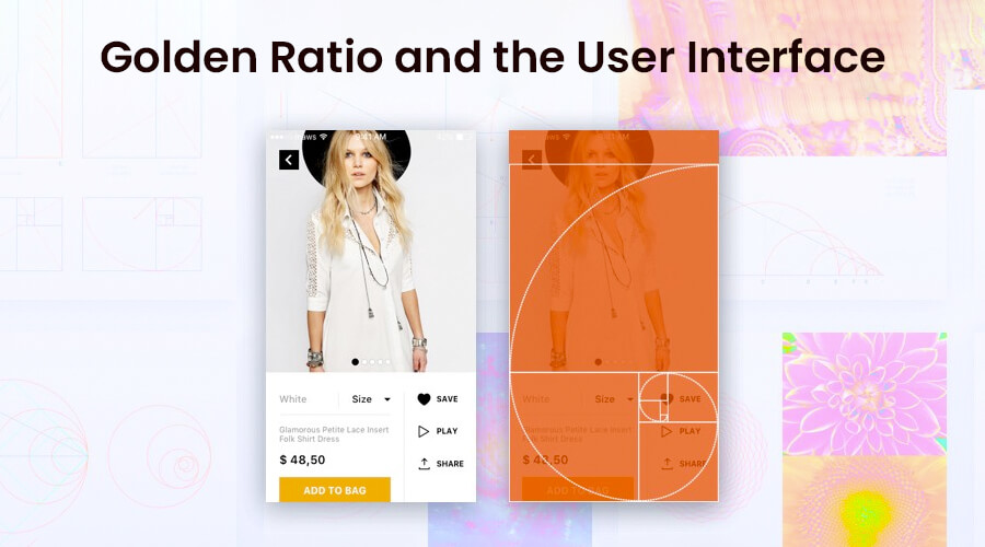
For optimal usability, UI elements are frequently placed using the golden ratio. The golden ratio can be employed during the wireframing process. Using the golden ratio as a guide, you may organize the layout’s structure and determine the ideal size for each UI element.
Experts use the golden ratio as a guide to ensure that the final web-ready image maintains a harmonious composition.
Read More: How to Calculate ROI for a Custom Software Development Project?
Exactly how can the golden ratio help user interface design?
Here are the benefits of the Golden Ration in Web and UI Designing:
1. Create Harmony among Different Elements
Designers frequently face the challenge of incorporating a large number of diverse content into a product, where each component is essential and cannot be substituted. The golden ratio can be used to bring everything together into a harmonious whole.
Designers can use a 1:1.618 ratio to separate the layout into pieces and then arrange the content accordingly. Users will be able to understand everything clearly, and the information will be easier to navigate because of it.
Check Out: Bad UX Design Examples And How To Fix Them
2. Create a Visual Hierarchy Effectively
There must be a clear visual hierarchy if the content is to make sense. It is a method for effectively organizing content sections. By integrating their respective tenets, designers improve their odds of producing striking visual content.
3. Improved User Friendliness
Using the Golden Ration, designers can create designs that are user-friendly and easily accessible. Know that a good web design can help any brand create that first good impression among its customers. Usually, it is seen that users assess a product’s user-friendliness based on their impressions of its interface. Users don’t take much time to determine whether or not they will use a particular website. They make snap judgments about whether or not they enjoy something after only a few seconds of exposure. That’s why it’s so important to create a design using the Golden ratio that can help brands create a quick first impression.
4. Stunningly Effective Typography
Before they can create an effective typeface, designers must stratify the textual material. Common types of text include headers, subheadings, body material, captions, and others. The golden ratio enables professionals to determine an appropriate proportion between typographic levels rapidly. For example, selecting a specific header size and dividing it by 1.618 produces an optimum proportion between the header and body copy.
5. Saves A Lot Of Time
One of the most important components of a strong UI is a well-organized layout. And “white spacing” is one of the major aspects when it comes to having a clean layout. The Golden Ratio comes in handy when it comes to white space, also known as the negative space between elements. It helps save a lot of time and effort. In order to maintain the integrity of the overall composition, designers must constantly monitor the quantity of white space present in the user interface. Using the golden ratio, designers can determine how much negative space is optimal for the layout of the design.
The Golden Ratio and Its Connection to Website Design
In the modern world, the Golden Ratio is also very applicable to the design of web pages. Desktop computers, tablets, and smartphones are all examples of devices that can benefit from using the golden ratio.
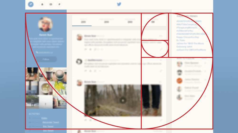
The golden ratio makes it possible to measure the header, footer, main content, and sidebar of a webpage. This subsequently assists in getting the pixel measurements as close as possible to the ideal ratio. Golden rectangles can be created on a website by using the Golden Ratio, which can be employed by the web designer when laying up the elements of certain pages on the site.
In addition to this, the Golden Ratio may be used to simplify the implementation of more complicated design strategies, which include typography, logo, and branding design.
The combination of an attractive user interface with the golden ratio has the potential to produce outstanding outcomes without having any impact whatsoever on the practicality of the website in question.
What Is The Connection Between the Golden Ratio and the User Interface?

When it comes to having an excellent user interface, the Golden ratio comes in handy. It can be utilized effectively in creating excellent user interface design. The Golden Ratio is a common tool that many designers turn to while creating a web design.
The golden ratio is widely used since it can be simply included in the wireframes that we create. This has led to its widespread acceptance. The use of the golden ratio provides designers with the certainty that the content that needs to be displayed will be prioritized. In addition, the layout’s requirements will be met without the need for any more work on the original design.
Due to its versatility, the Golden Ratio can be used to create design patterns even if the numbers employed are not fixed. A website developed with the golden ratio’s proportions helps to create a significant impression in the minds of users, thereby increasing the company’s popularity.
Wrapping it up…
So, this is all about the Golden Ratio. Hope this article helps you make the best use of the golden ratio in web and UI designs.
This mathematical formula can be found repeatedly in both nature and artistic creations. It can be used in numerous endeavors, including web and UI designing. Know that designing with the golden ratio in mind creates a pleasing aesthetic and functional end result. The best part about this ratio is that it is very simple to use.
Furthermore, the golden ratio can aid in the development of digital goods that are both functional and aesthetically pleasing to their target audiences.


