Though it is still in the testing stage, Gmail, your reliable email friend, maybe getting a makeover! Get ready for a chat-style new Gmail UI reply that could completely change the way you reply to messages. However, there may be some advantages and disadvantages to this redesign. Let us get more specific:
Goodbye Scrolling, Hello Chat-style:
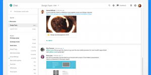
Essentially, the suggested modification would eliminate the customary email reply window at the bottom and replace it with a persistent chat-like box that is comfortably positioned at the base of the screen, a la Google Chat. You would be able to tap to expand the keyboard, type your response, and send it all while maintaining context awareness of the original email.
Simplicity reigns:
Ease of use is the first priority in the new layout, where creating replies is made easier with recognizable components like media and emoji buttons surrounding the text field. Additionally, choosing recipients is integrated into the process so there are no additional clicks required.
But is it all smooth sailing?
Power users may object. Getting to “Reply All” and “Forward” might need an extra step in this redesign, which could mess with their already-established workflow. Where Quick Replies is located is also unclear, therefore certain features are left unfinished.
Also See: Gmail Offline Works
Early days, big impact:
Although it is still in the early stages of development, this redesign has the potential to drastically alter how we use Gmail. While power users may find it difficult to adjust to the changes to their established routines, casual users may find the chat-style approach to be more seamless and entertaining.
The Future Unfolds:
There is a chance for a more user-friendly and intuitive email experience, but it will depend on how well Google balances new features with the demands of regular users. Only time will tell if the chat-style reply UI becomes a permanent fixture in Gmail. Google is actively gathering feedback and refining the design based on user responses.
So, should you be excited?
This redesign might be a welcome addition if you are flexible and seeking for a more efficient approach to respond to emails. If, on the other hand, your workflow depends heavily on existing features, you should wait and see how the final version turns out before making a decision.
In the end, the reply UI that looks like a chat window represents Google’s ongoing attempts to improve Gmail and accommodate a wide range of user preferences. Whether this feature turns out to be a hit or a tiny blip, one thing is certain: email is still evolving, and it is an exciting ride to be a part of.

