Data visualization is a broad process that involves the use of elements like maps, columns, graphs, charts, and the like to present information or data. The essence of data visualization tools is to make it easy to comprehend the data in question. Data visualization on the other hand assists in categorizing and sorting a lot of data in order to obtain actionable leads. In today’s digital era businesses and other sectors can benefit from turning data into visual information. It helps identify patterns and trends that are difficult to find in discreet data. Data visualization also supports conveying complex ideas clearly and engagingly.
Graphic information enables a person to make a decision based on the information displayed in a particular graphic. General visual displays refer to graphs, which comprise bar graphs, pie graphs, line graphs, maps, and info graphs. Enabling core technology with features including machine learning and artificial intelligence has boosted the invention of several data visualization technologies.
Specific applications called data visualization tools allow you to create and modify various types of graph plots, charts, and other types of data representations. These solutions usually comprise core capabilities accompanied by built-in options and dress-up tools to ease the process even for non-professionals. In this article, learn about the best 8 data visualization tools and their advantages for varied sectors.
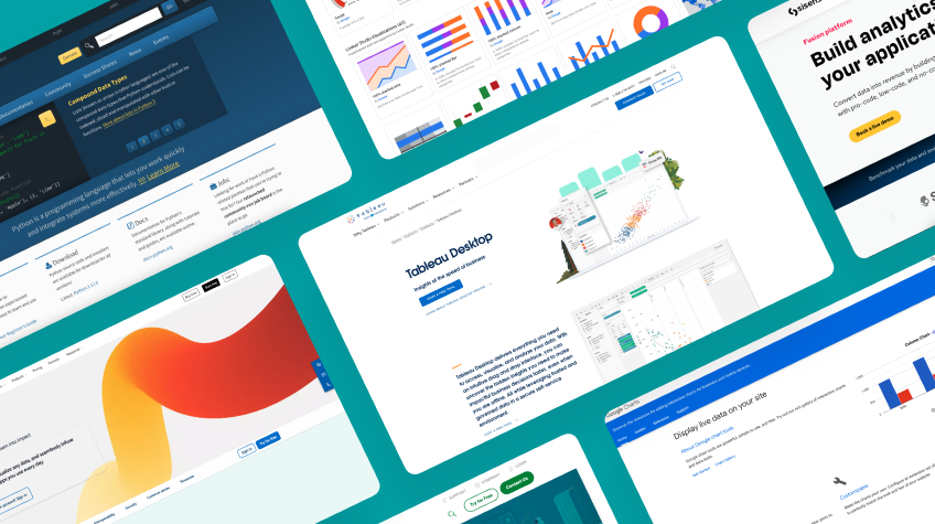
List of the Best 8 Data Visualization Tools
Several data visualization tools are available in the market that enhance the ability to understand, communicate, and make informed decisions based on data. Complex data is easier to understand and more accessible when presented visually. Visualizations can assist you in making more informed and data-driven decisions by giving you a clear summary of the available facts. Here are the top 8 data visualization tools:
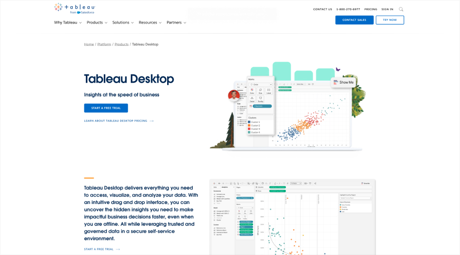
1. Tableau – Easy-to-Use Data Visualization Software
Tableau is a famous data visualization tool with easy-to-use features and is ideal for businesses of all sizes. The tool is equipped with powerful visualization capabilities that help a business make data-driven decisions and communicate complex information effectively.
Advantages of Tableau
Tableau comes with advanced features including a drag-and-drop interface, interactive dashboards, and extensive customization options. The tool can be easily integrated with a diverse data source.
This is a powerful and flexible visualization tool suitable for businesses of all types and sizes. A user can easily and quickly build charts, graphs, and dashboards.
The tool is ideal to take advantage of varied visualization capabilities such as bar charts, line graphs, scatter plots, maps, and more, to effectively communicate complex data.
Tableau comes with the best data integration and connectivity features to be compatible with a wide range of data sources.
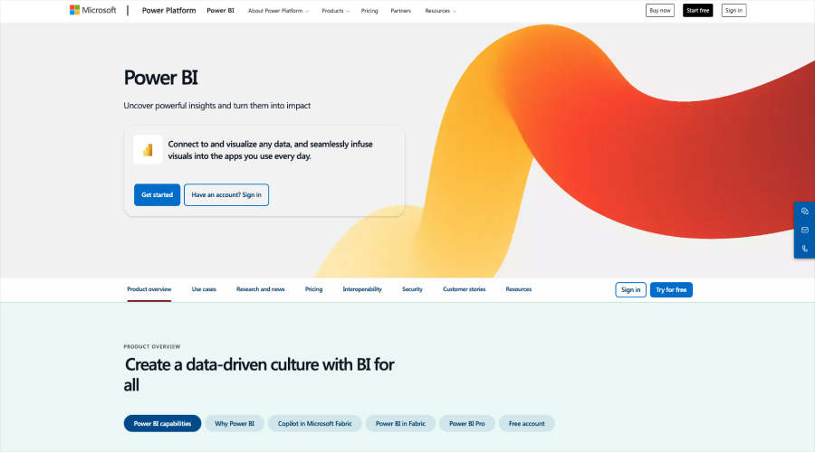
2. Power BI – Data Visualization Tool by Microsoft
This data visualization tool is known for its seamless integration with a wide range of Microsoft products. The tool is equipped with features like interactive dashboards, natural language queries, and mobile app support. This powerful tool is best for businesses that are using Microsft products extensively.
Advantages of Power BI :
Power BI is an effective visualization tool that helps in transforming complex and raw data into simple graphical information.
The tool is capable of connecting with multiple data sources including Excel spreadsheets, databases, and cloud services.
Power BI offers an extensive collection of visualizations, such as maps, graphs, charts, and custom visuals, to help understandably show data.
With mobile access capacities, it provides iOS and Android mobile apps that let customers view and use dashboards when they’re on the road.
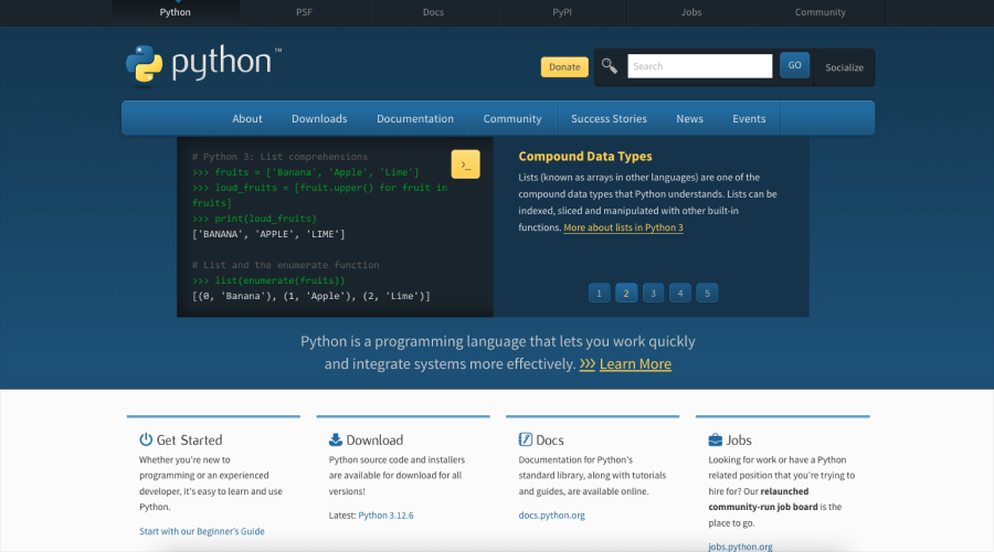
3. Python Libraries – Best for Developers and Data Scientists
Python Libraries is a powerful data visualization tool that carries a vast ecosystem of libraries including (Matplotlib, Seaborn, Plotly, etc.). This data visualization tool is ideal for developers and data scientists as it offers great control over visualization to design for specific needs.
Advantages of Python Libraries :
Python modules let you customize your visualizations to your exact specifications by giving you fine-grained control over every component of them.
Plots’ appearance, arrangement, and interaction can all be readily altered to suit the situation and target audience.
The tool is best for companies in need of an all-inclusive data platform with cutting-edge analytical tools.
Numerous visualization types, such as scatter plots, histograms, heatmaps, line charts, bar charts, and more, are supported by Python packages.
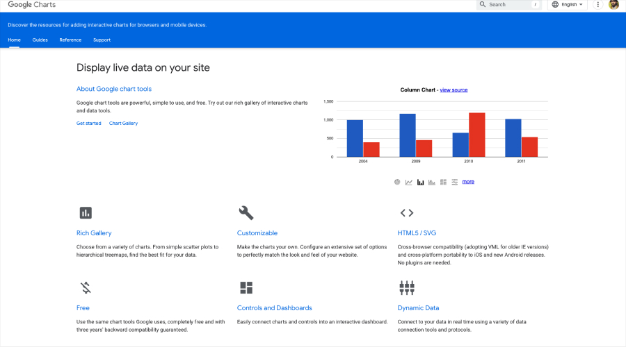
4. Google Charts – Simple and Free-to-Use
Easy to use, flexibility, and integration with Google products make this tool a preferred choice for varied businesses and individual use. A JavaScript package called Google Charts provides a large selection of interactive graphs and charts.
Advantages of Google Charts :
Google Charts offers a wide variety of chart styles, such as maps, scatter plots, line bars, and pie charts, among others.
It also provides tools to allow users to interact with charts, such as tooltips, zooming, and panning.
The tool provides a wide range of customization options to allow charts to be branded and tailored to specific purposes.
Google Charts integrates readily with several data sources, such as custom data feeds, Google Sheets, and Google Analytics. The tool functions flawlessly on a variety of devices and web browsers.
5. Qlik Sense
Qlik Sense is an AI-driven and built with a multi-cloud framework that supports the decision-making process of an organization. Some of the advanced options available with the data visualization tool include associative analysis, dashboards, and natural language search.
Advantages of Qlik Sense :
It is recognized as a highly effective business intelligence tool that allows for increasing the speed of work due to the presence of information unnoticeable at first glance in the analyzed material.
Users can also provide a more detailed description of a given point in the data analysis which is in fact what Qlik Sense is all about.
Qlik Sense offers easy possibilities that allow users to filter and visualize patterns, tendencies, and outliers in their data.
There is a range of views available including maps, graphs, and charts and the tool allows to display of the data in the most comprehensible and simple way.
Qlik Sense allows the creation of shared areas where users can share dashboards and their findings with their colleagues.
6. Looker
Looker is a business intelligence software based on the cloud that allows data discoveries. The tool is recommended for businesses that need a large program with strong analytical capabilities. I like that it has this user-accessible design which is loved by many.
Advantages of Looker :
Looker gives users a powerful data modeling language called LookML, where users define the computations and relationships with data.
The data visualization tool provides users with a friendly user interface in terms of data analysis and knowledge acquisition.
For visuals, there is a wide variety to choose from, including maps, graphs, and charts to name but a few to aid in the presentation of data in a clear and hassle-free method.
This tool enhances the process by which a team works by enabling its users to share the resultant dashboards and intelligence gathered.
7. Sisense
This data visualization tool uses AI to uncover the hidden insights and patterns in the data. The tool comes with the best features including AI-driven insights, interactive dashboards, and embedded analytics.
Advantages of Sisense :
The tool is focused on supporting businesses in the interactive and user-friendly exploration, analysis, and sharing of data insights.
Sisense offers an extensive collection of visualizations, such as maps, graphs, charts, and custom visuals, to help understandably show data.
It establishes connections with numerous data sources, such as cloud apps, spreadsheets, and databases.
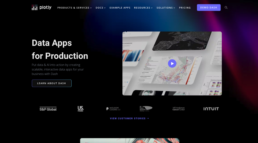
8. Ploty
The data visualization tool is lauded for its features such as interactive visualizations, 3D plots, and a wide range of chart types. The platform comes with interactive visualization libraries that support a variety of programming languages including Python, R, JavaScript, and MATLAB.
Advantages of Ploty :
Ploty intended to support businesses in the interactive and user-friendly exploration, analysis, and sharing of data insights.
The tool offers an extensive collection of visualizations, such as maps, graphs, charts, and custom visuals, to help understandably show data.
It establishes connections with numerous data sources, such as cloud apps, spreadsheets, and databases.
Conclusion In conclusion, data visualization tools are software applications that help individuals and businesses transform complex data into simple and meaningful graphical information. These tools are equipped with analytic capacities to uncover hidden insights within the data. However, choosing the best tool depends on specific needs, data sources, and technical expertise. You must also consider factors like cost, features, and integration compatibility with data sources.